Make it
Moyne
Make it Moyne
About Make it Moyne
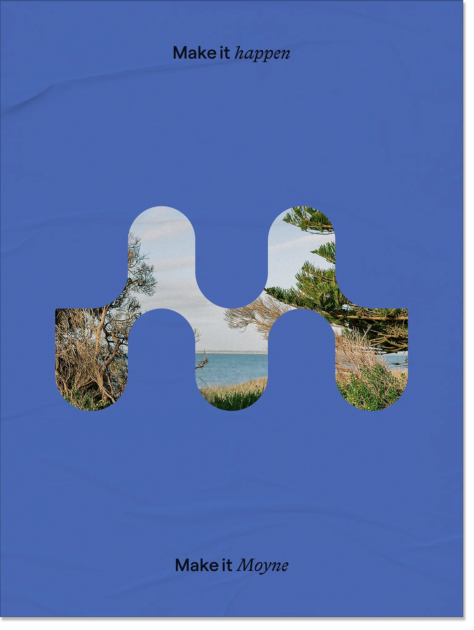
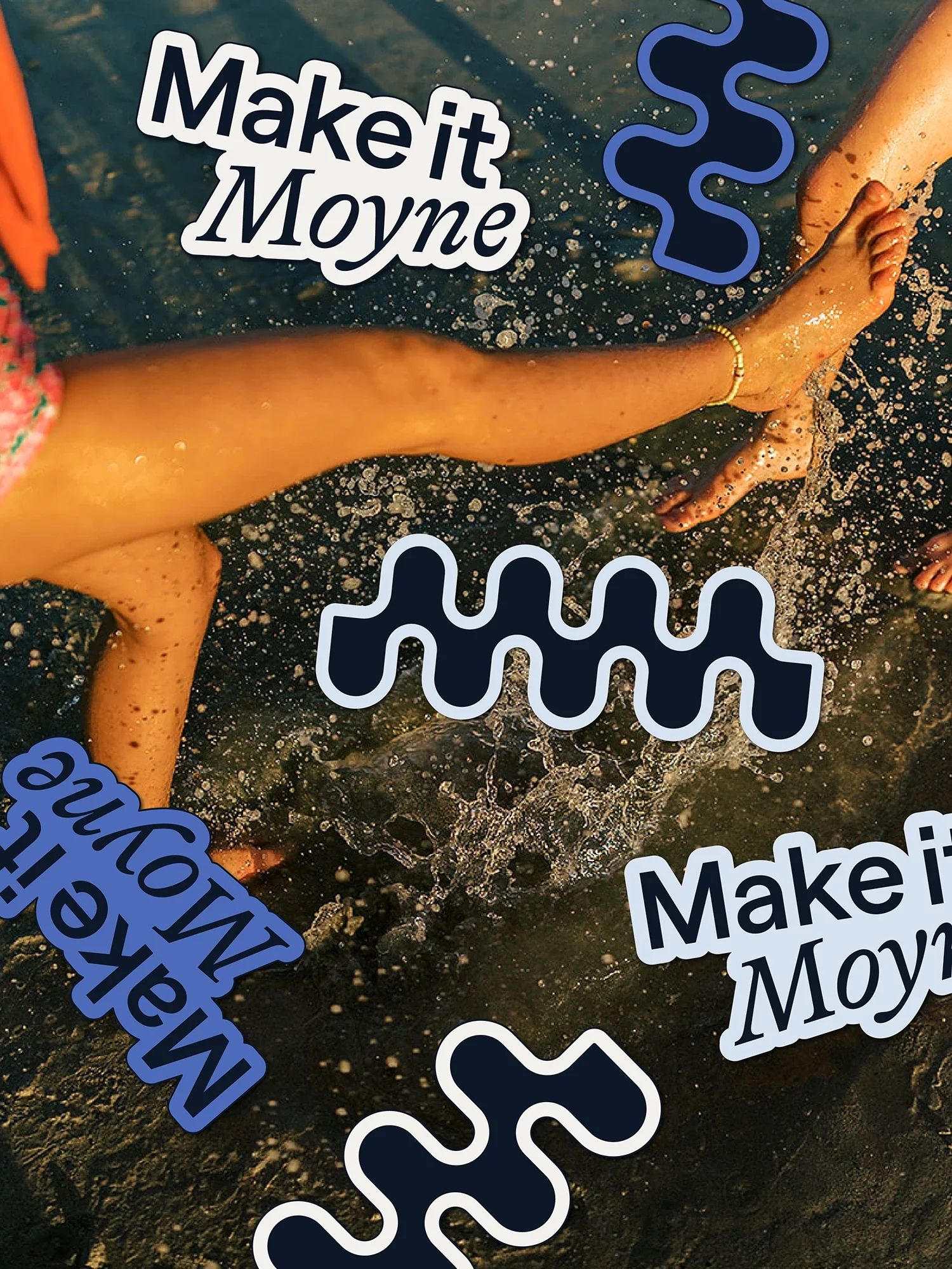
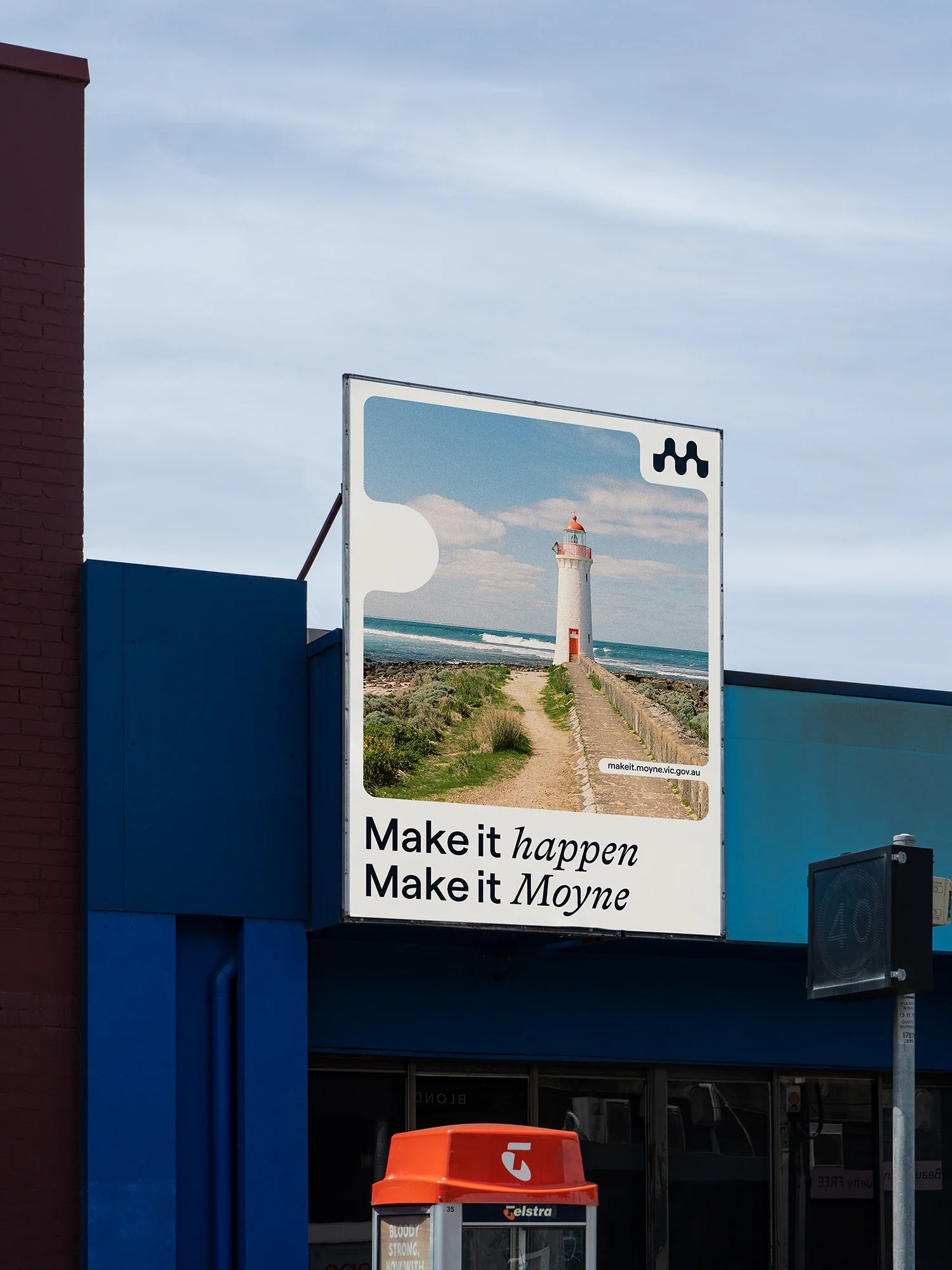
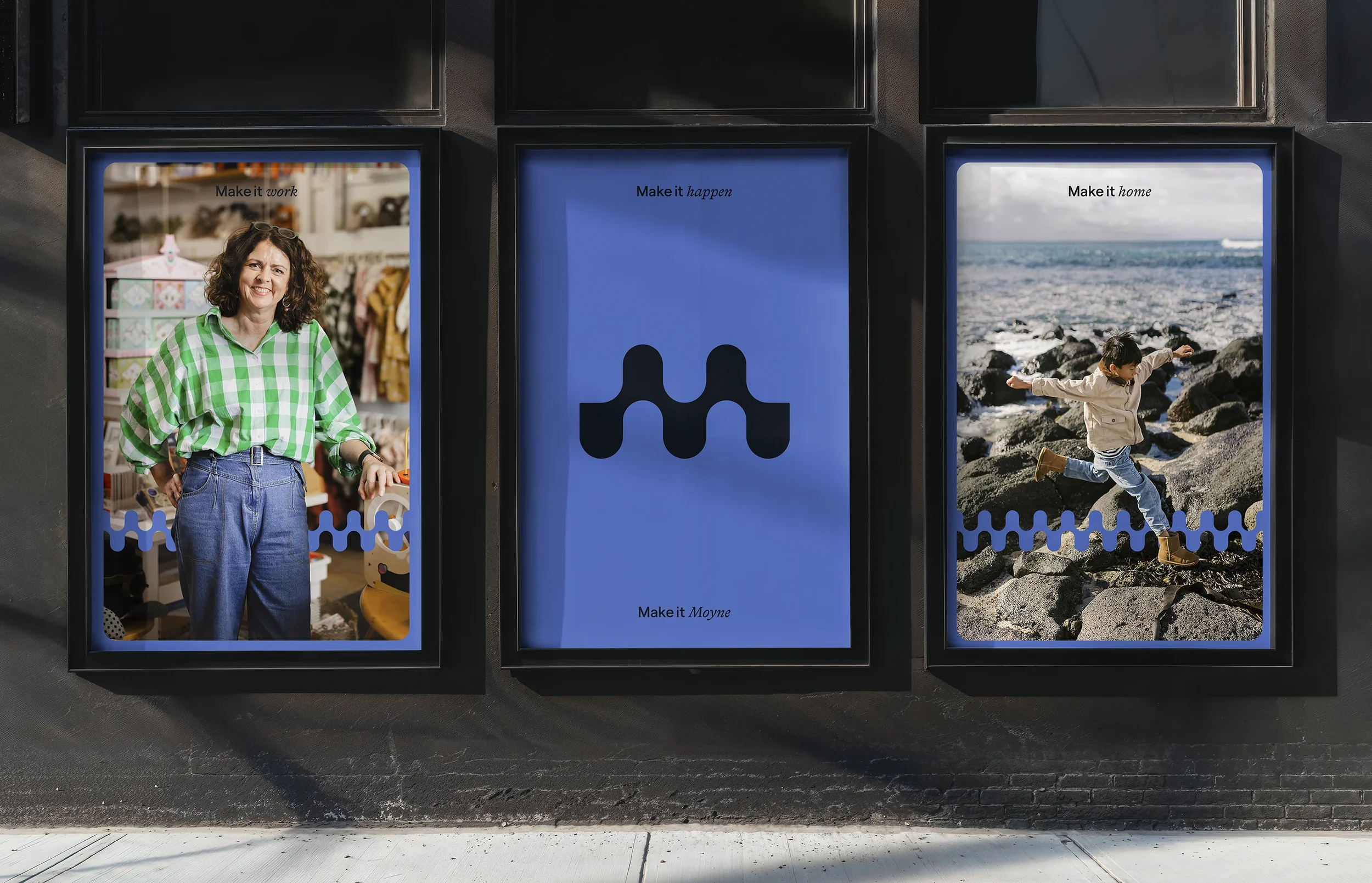
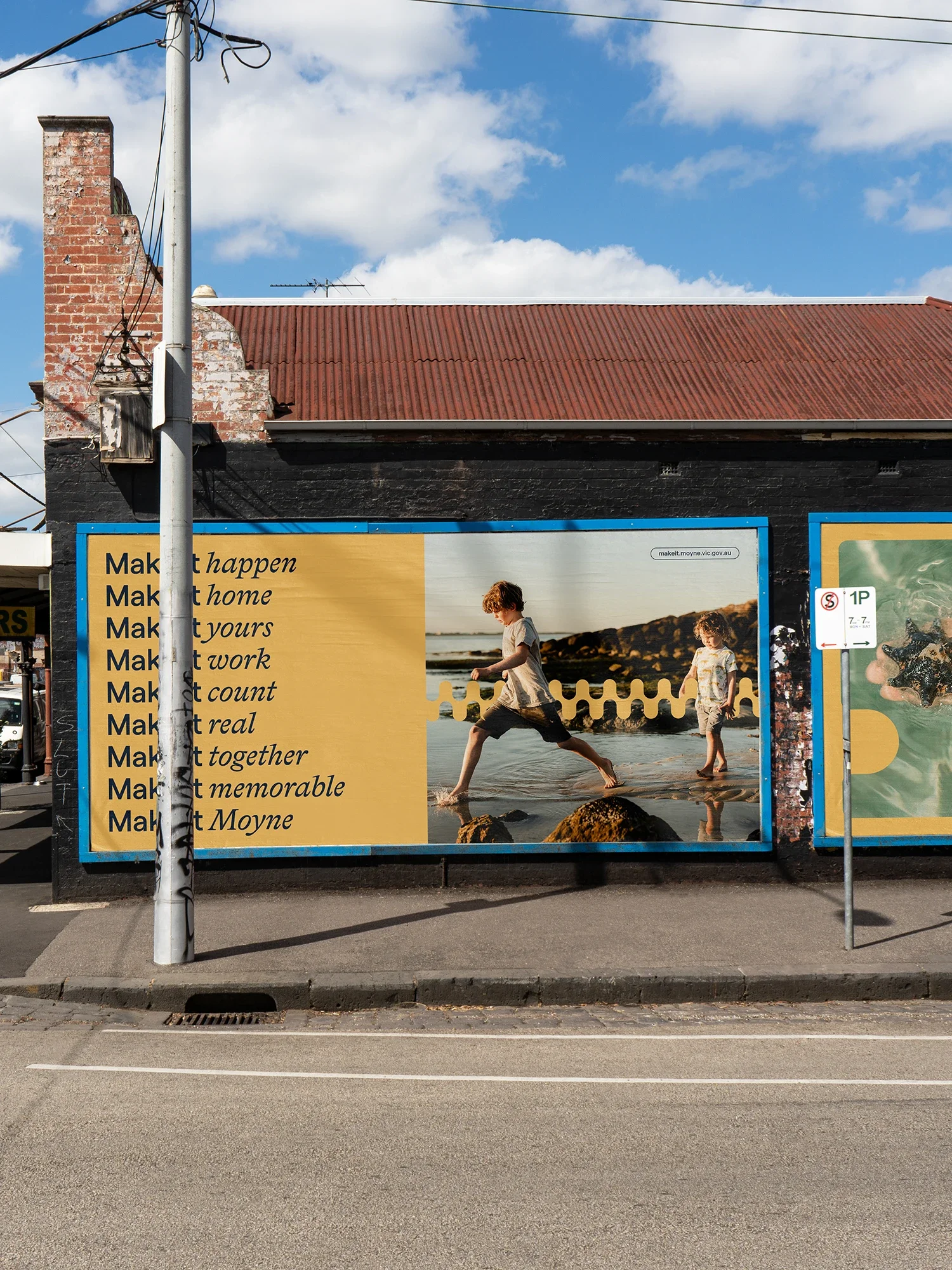
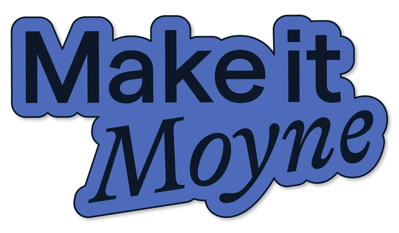
Make It Moyne started life as Live Work Invest Moyne Shire, a sister brand and website to Moyne Shire, designed to attract people to the region. The brief was sensible, but open. Our work started with the name, because ‘Live, Work, Invest [insert shire name here]’ had been done to death. A brand name should make a solid first impression and spark curiosity. Make It Moyne does just that. It’s memorable, it rolls off the tongue and it gave us the foundation for a flexible copy system that could be woven through every expression of the brand. Make it here. Make it happen. Make it Moyne.
And then there was the colour palette. Never did we think the West Coast Eagles combo of blue and yellow could look good. We were tempted to go rogue, naturally, but instead took the existing Moyne Shire Council palette and gave it a serious glow-up. The result keeps a visual connection to its straighty-one-eighty sister brand, while feeling younger, more energetic and distinctively Make it Moyne.
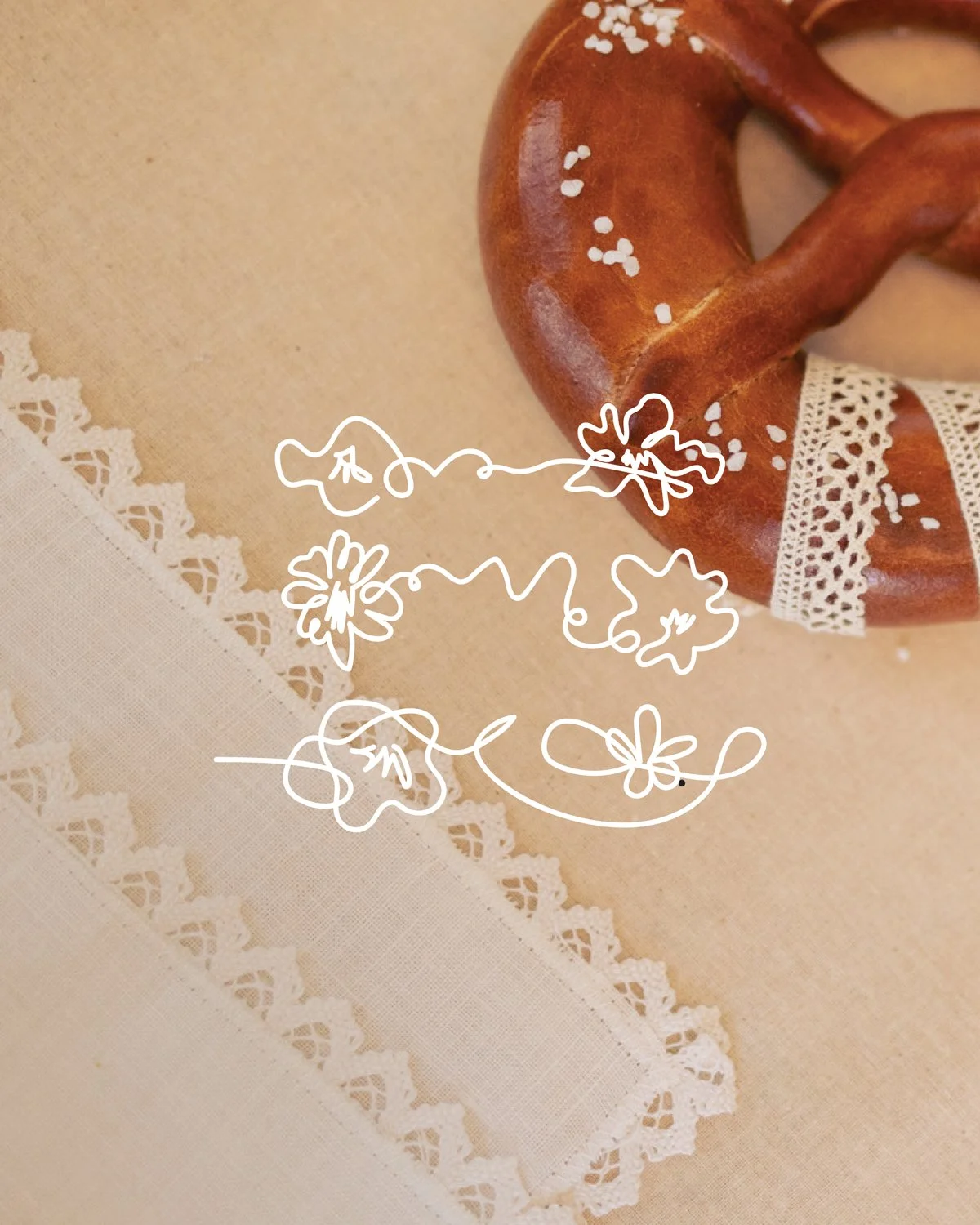
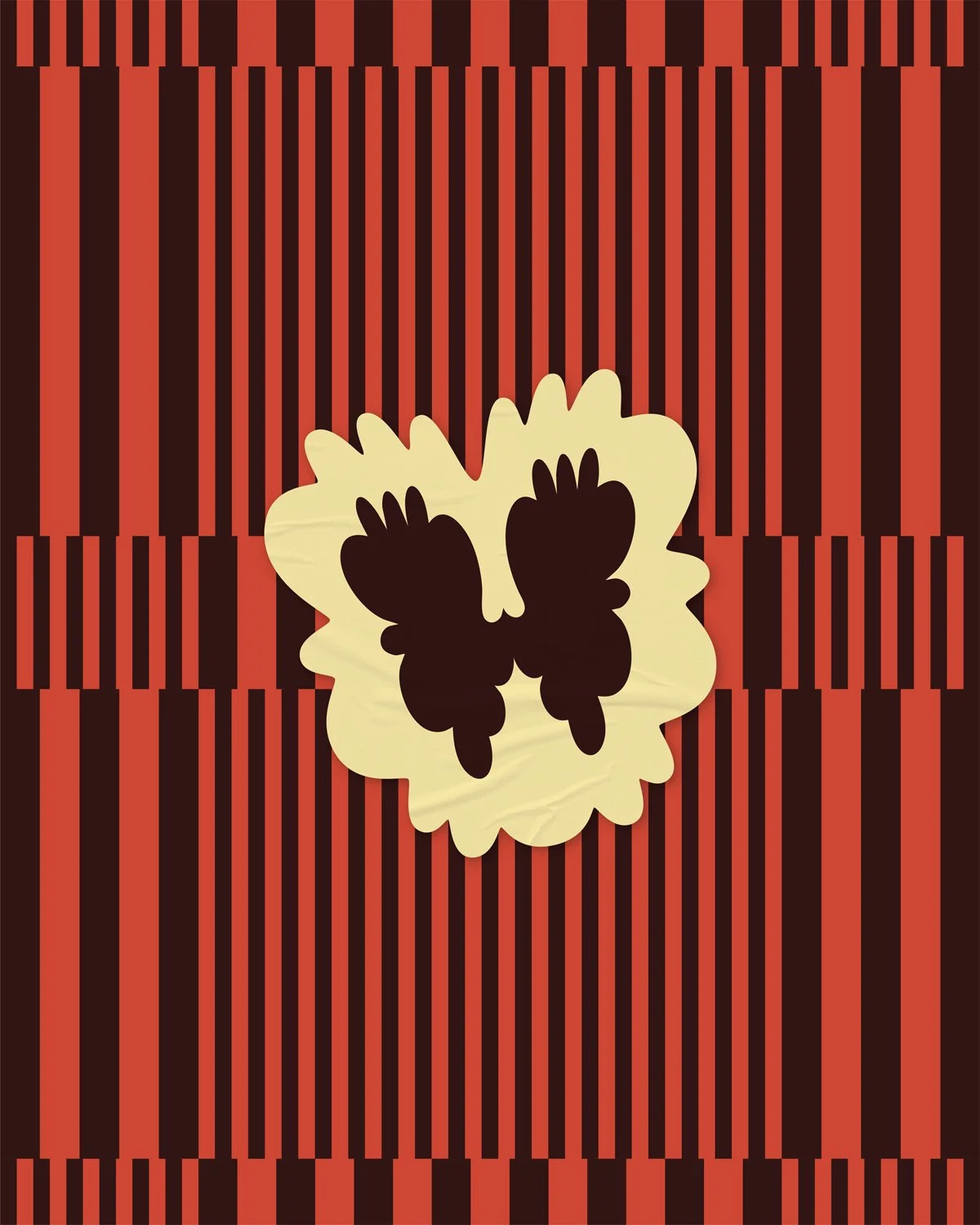
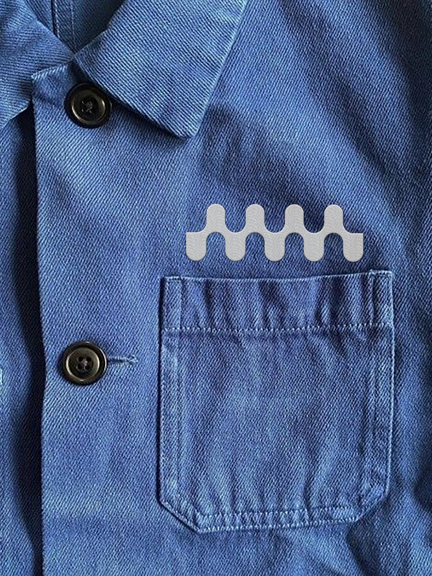
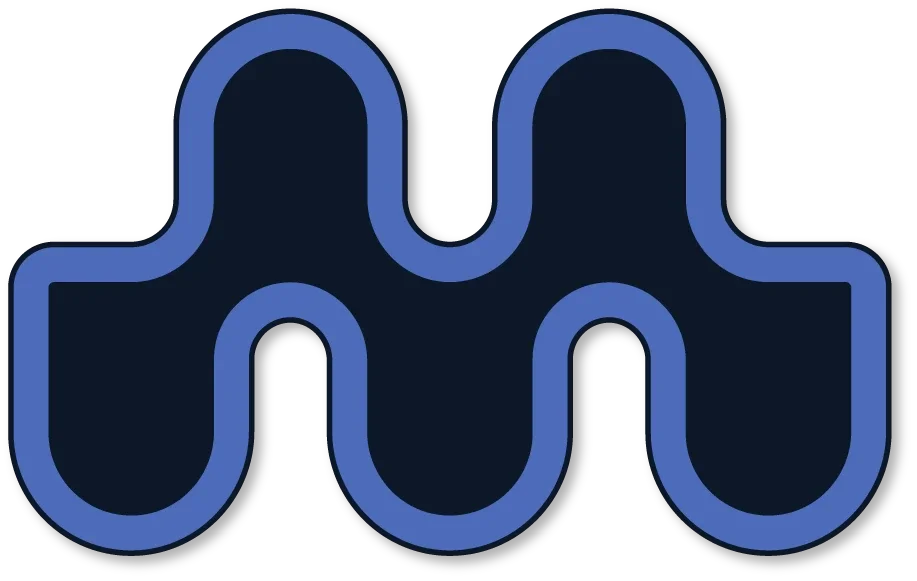
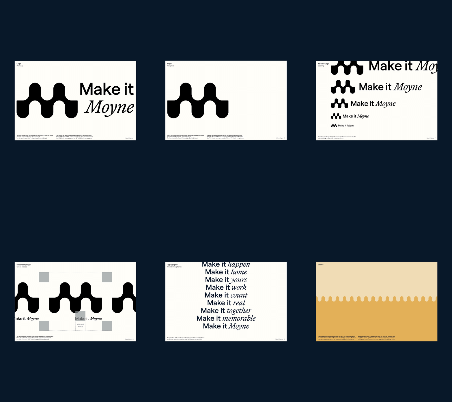
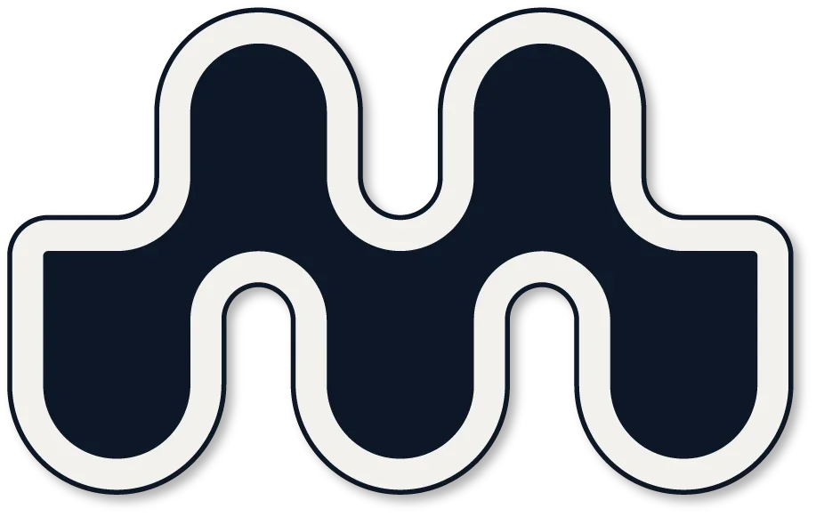
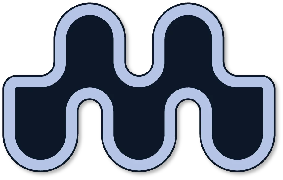
The M mark draws from the landscape of the shire: the eternal rhythm of the ocean, rolling volcanic plains, the silhouette of Tower Hill, the undulating patterns of basalt and sandstone along the coast and the sweeping curve of the coastline itself. But rather than locking the logo into one fixed shape, we designed it to move. It can sit quietly as a simple M or stretch, swell and roll into an expressive wave across the screen or page.
The result is a corporate identity that feels anything but corporate. It’s flexible, recognisable, proudly connected to Moyne and built to speak to the people the region is hoping to attract. And look, we hate to say it, but blue and yellow might actually look pretty bloody good together. We’ll never hear the end of this.

Secrets
Corporate jobs can be a bit dull. Sorry! The uninspiring colour-palette-that-must-not-be-changed, the bland stock image library and the determination to continue with the logo receptionist Barbara made in MS Paint 17 years ago. This project, however, is a beautiful example of how we can Studio Dreamafy a corporate job when the client is open to creativity — and willing to upgrade from Barb’s creation. We also fully respect a runner-to-heels commute swap. This has absolutely nothing to do with the project, but feels very corporate to us.
Project scope
Brand design
Naming
Art direction
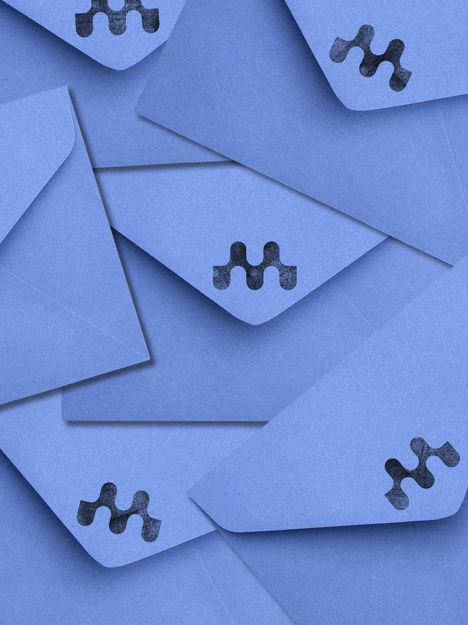
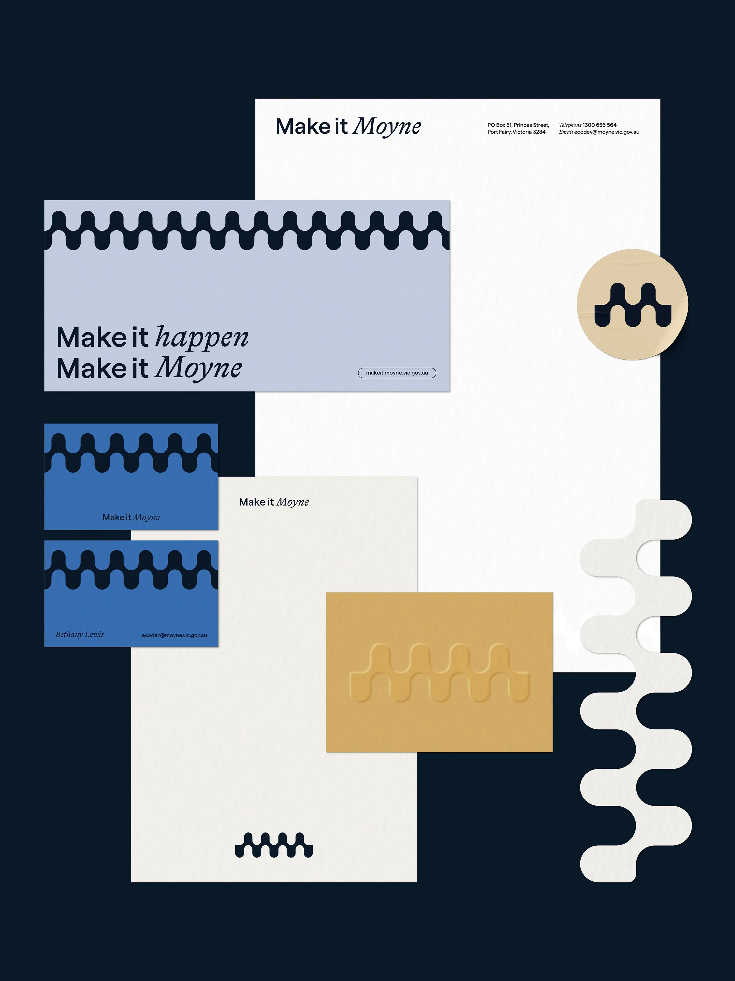
Stationery
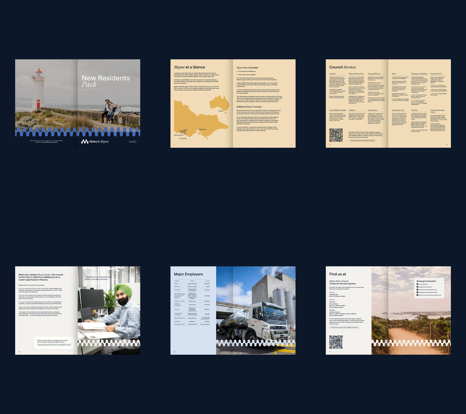
Publication design
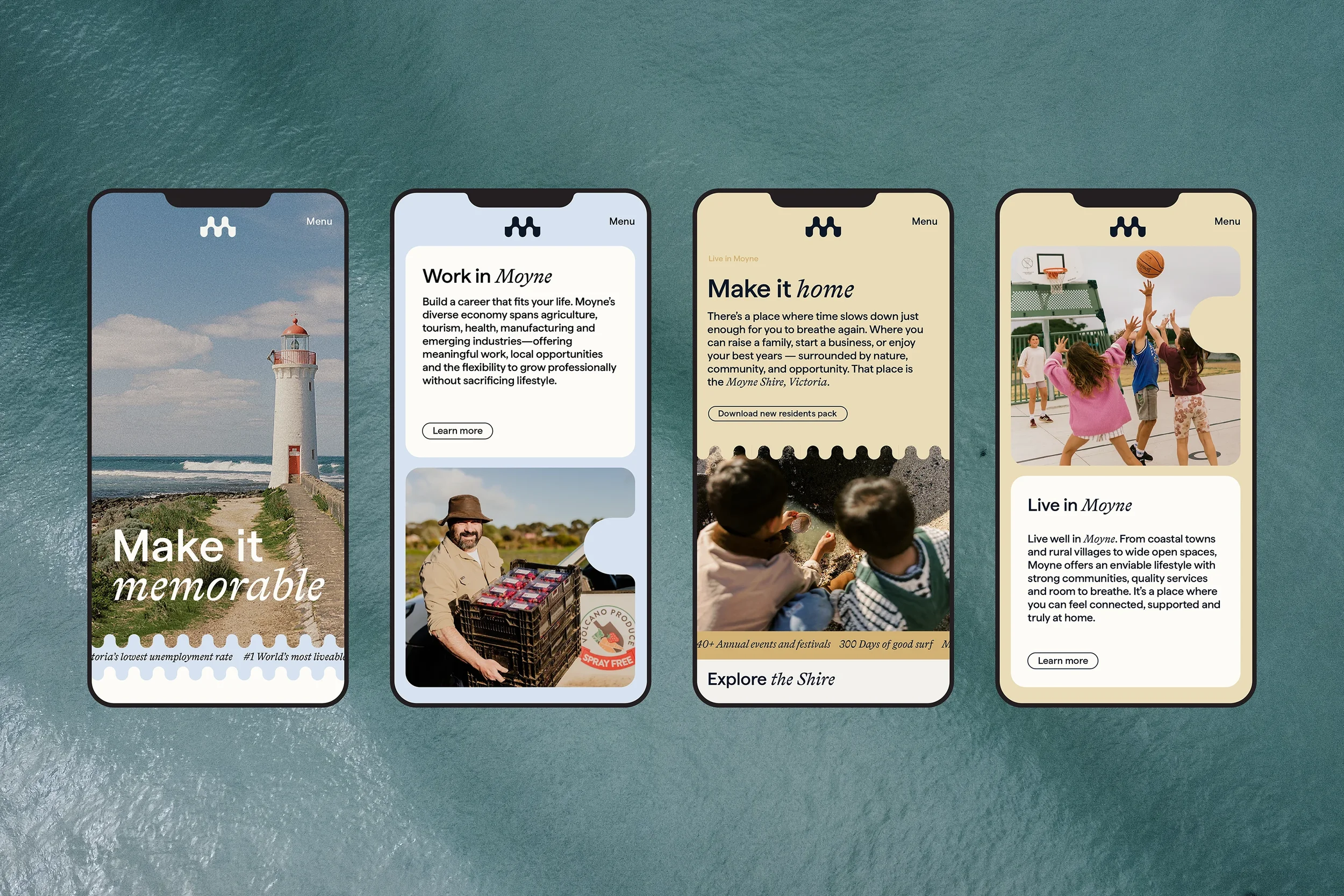
Website
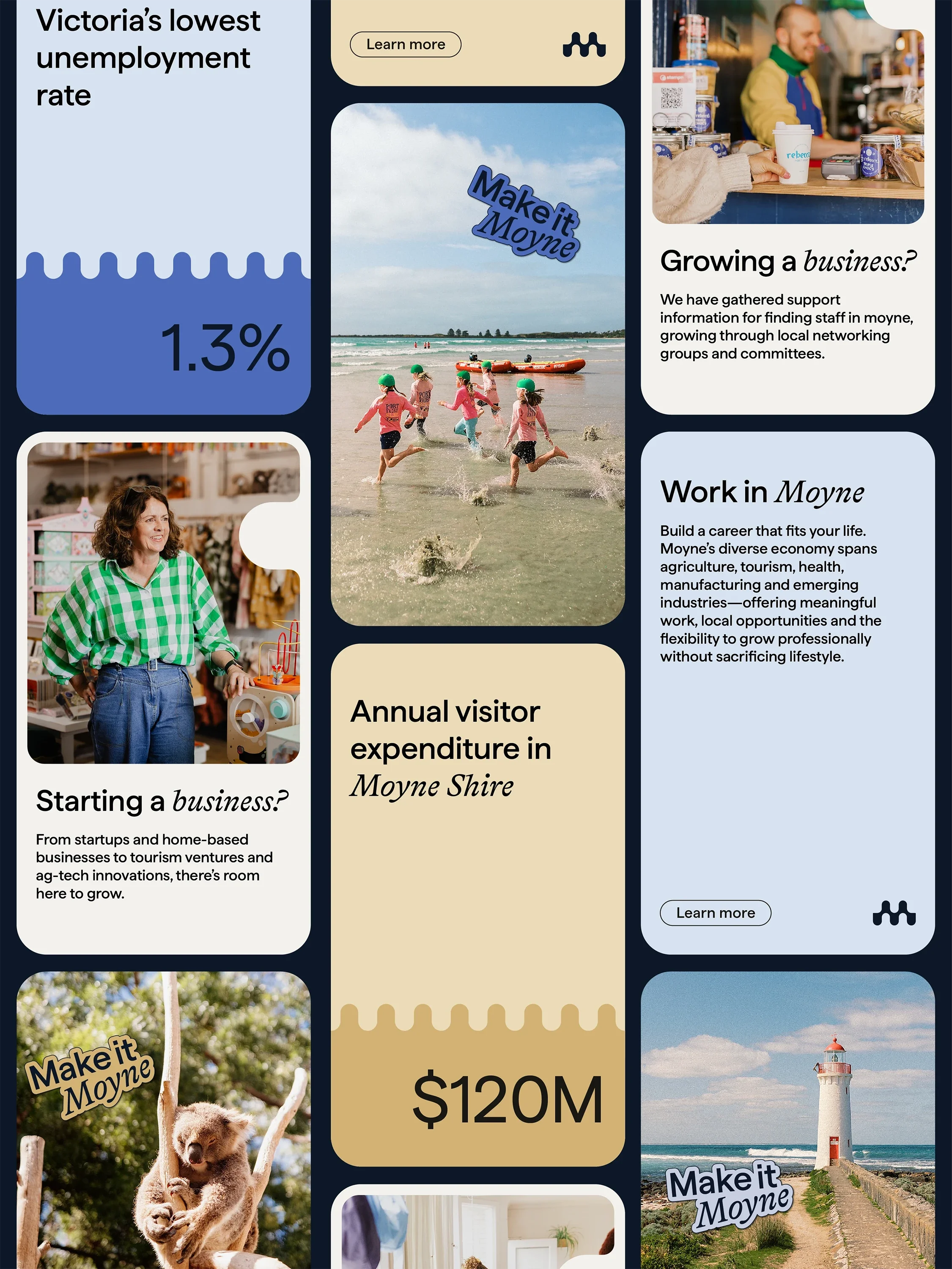
Social media templates
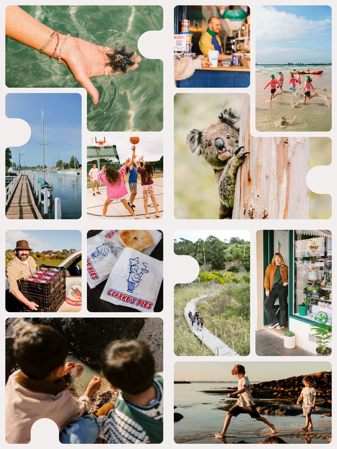
Photography by Jennah King, Jo O’Keefe, Zoe Photography Studio, We Met In June
Kind words
Working with Sinead has been an absolute pleasure. From our initial meeting, she was incredibly thorough and really took the time to understand what we were looking for. She helped us think outside the box and brought ideas to the table that we hadn’t considered.
We loved the design process and couldn’t be happier with the final outcome. Sinead was so patient and supportive throughout the whole process, making everything easy.
Thank you for all your hard work, we absolutely love the finished product!
— Jo MacKenzie, Moyne Shire Economic Development & Tourism Coordinator