GreenPrint Projects
GreenPrint
Projects

About GreenPrint Projects
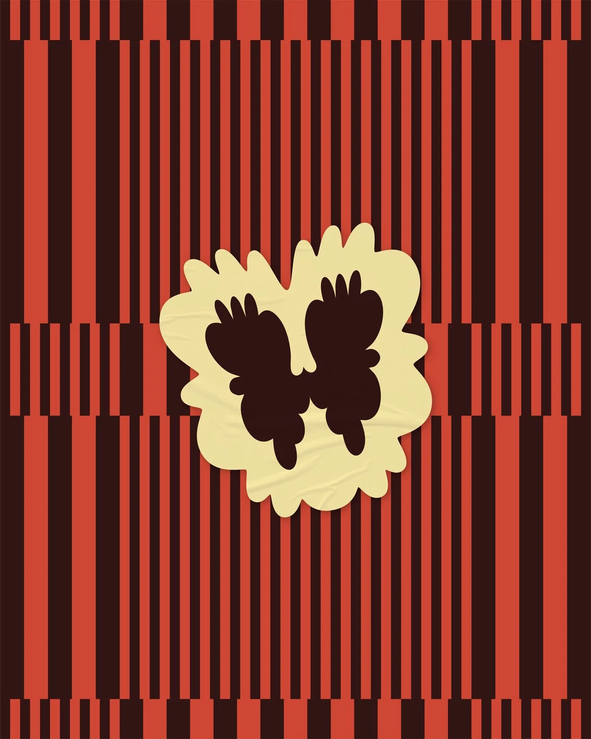
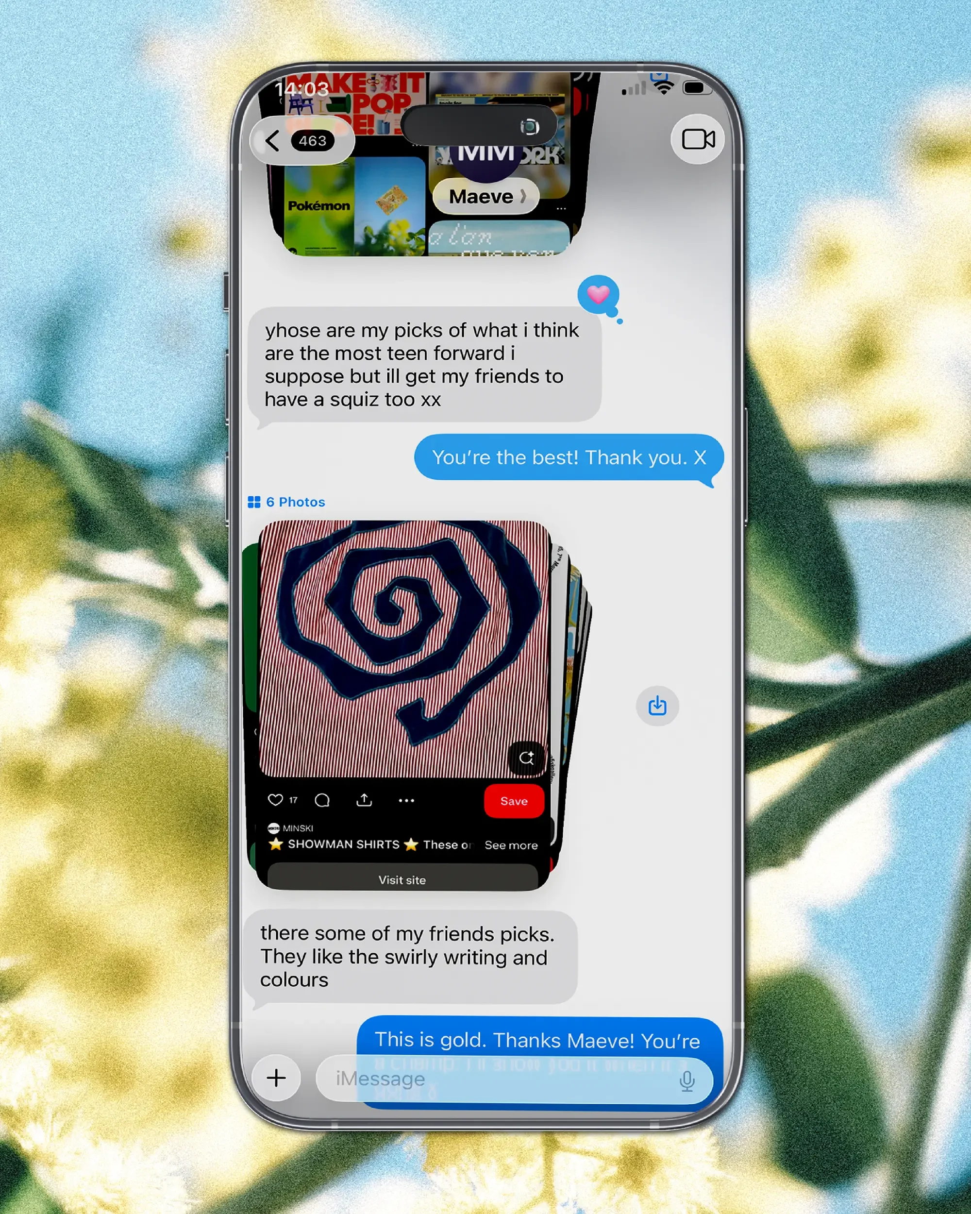
GreenPrint Projects turn school gardens into living classrooms. Aimed at getting keen teens involved in the entire process of designing, creating and maintaining once unloved school gardens, projects are proudly student-led, so the identity needed to appeal to them.
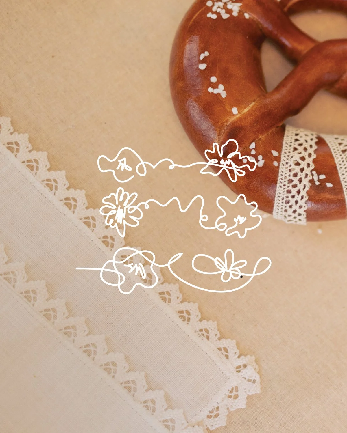
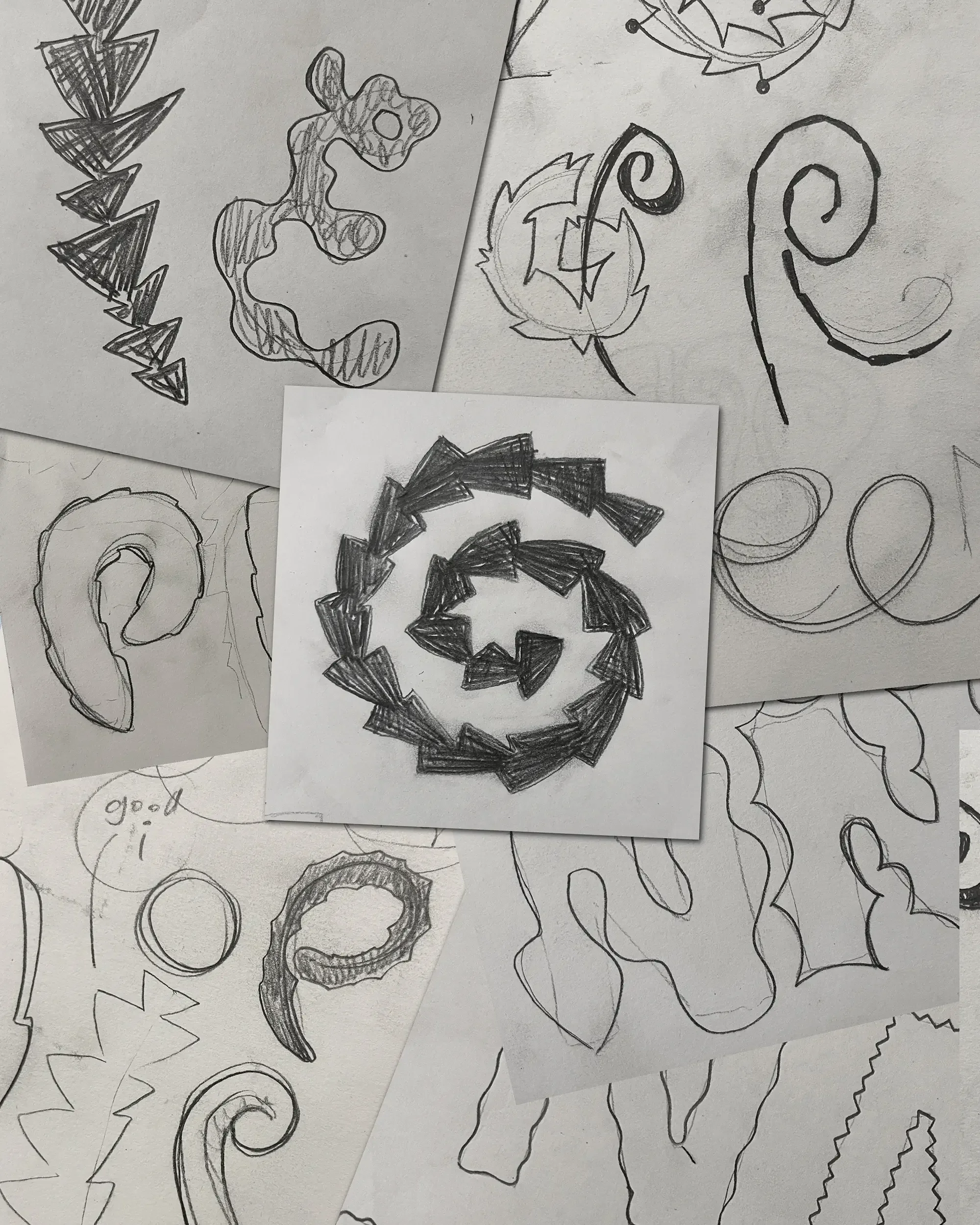
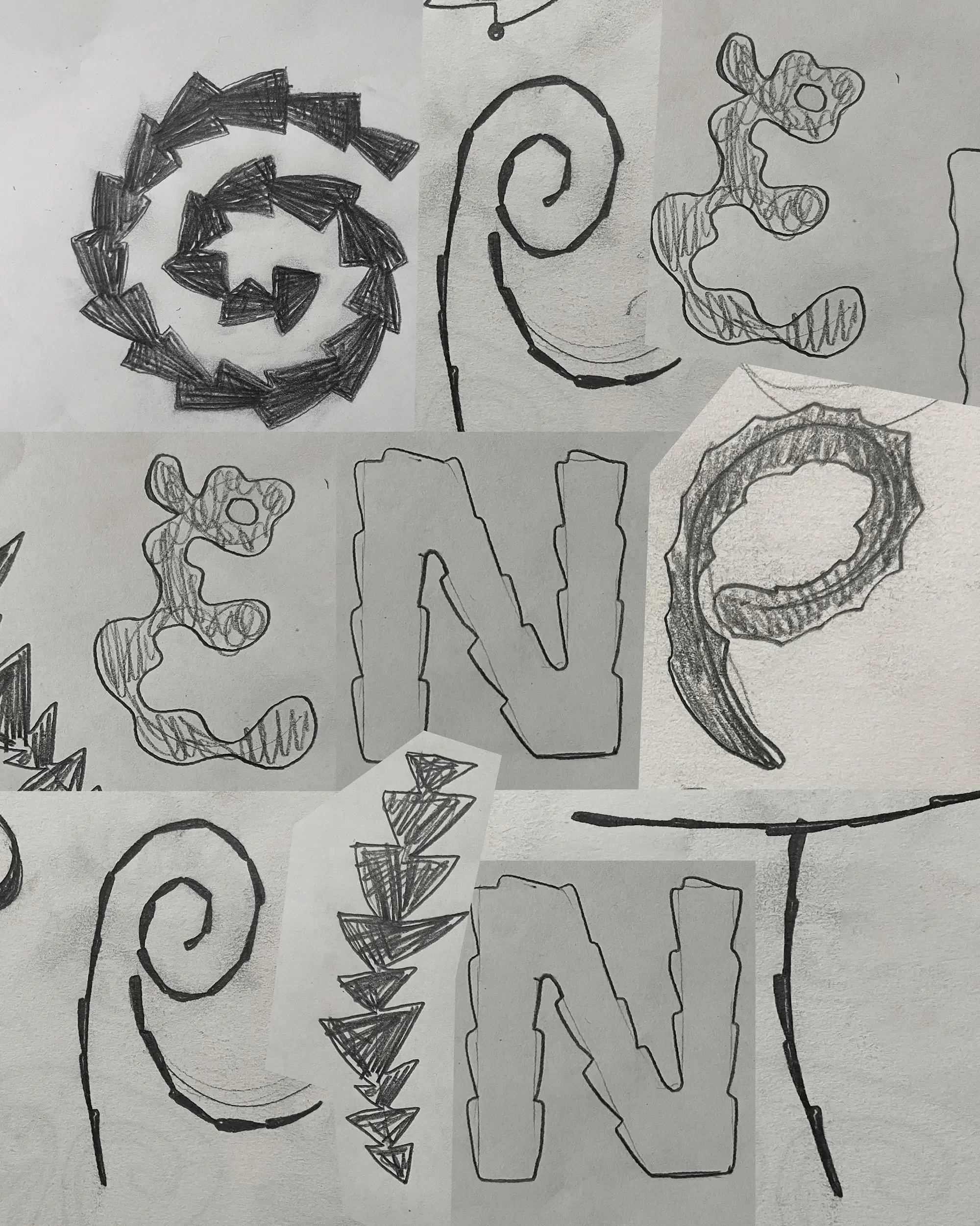
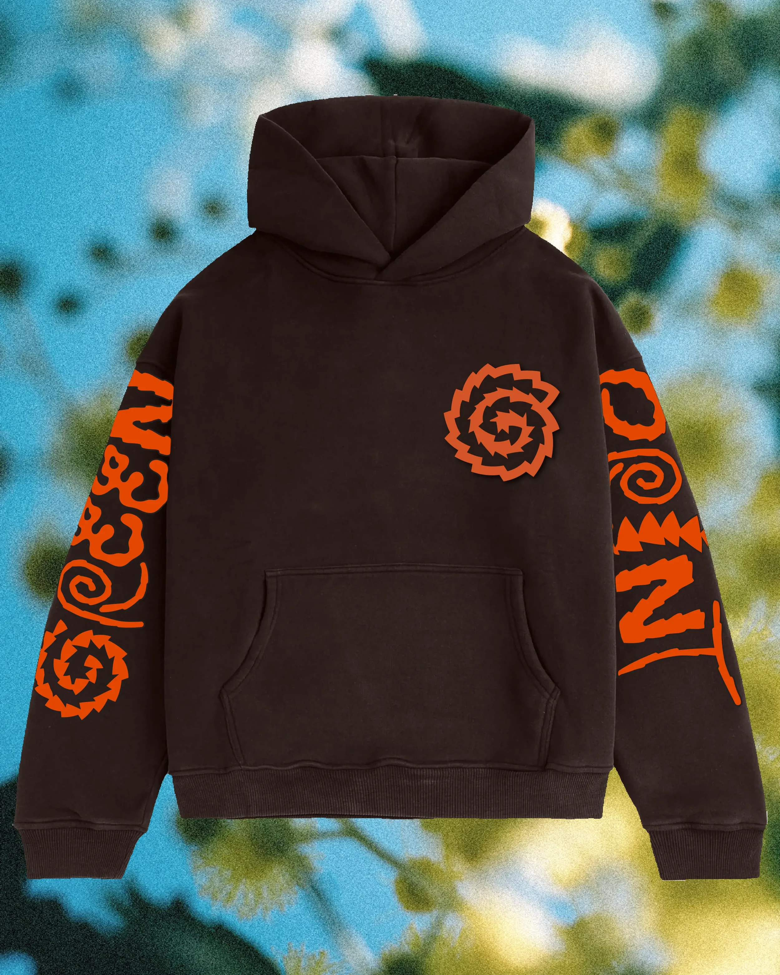
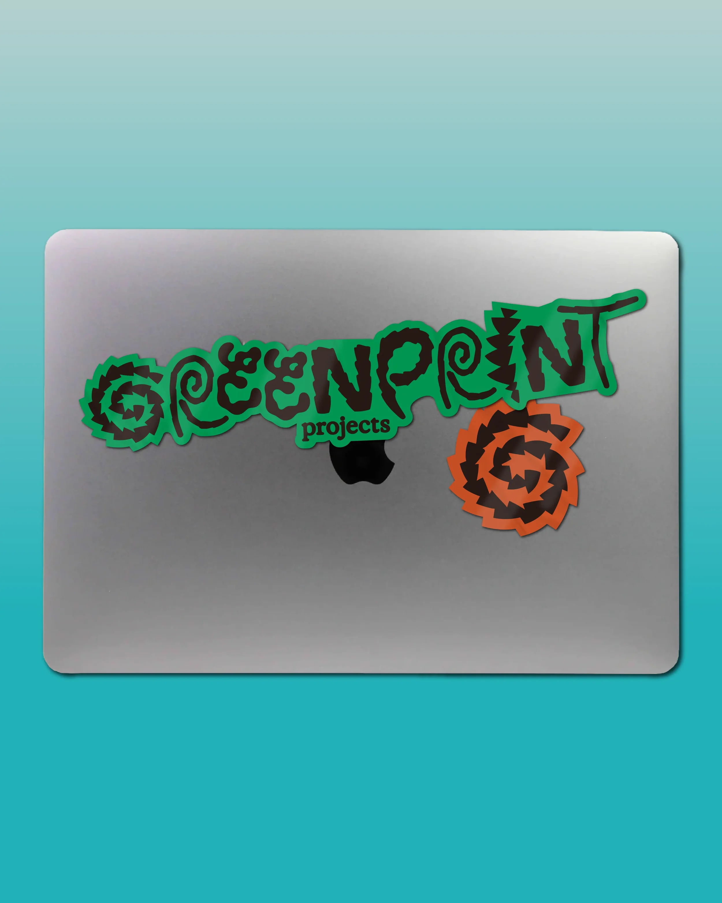
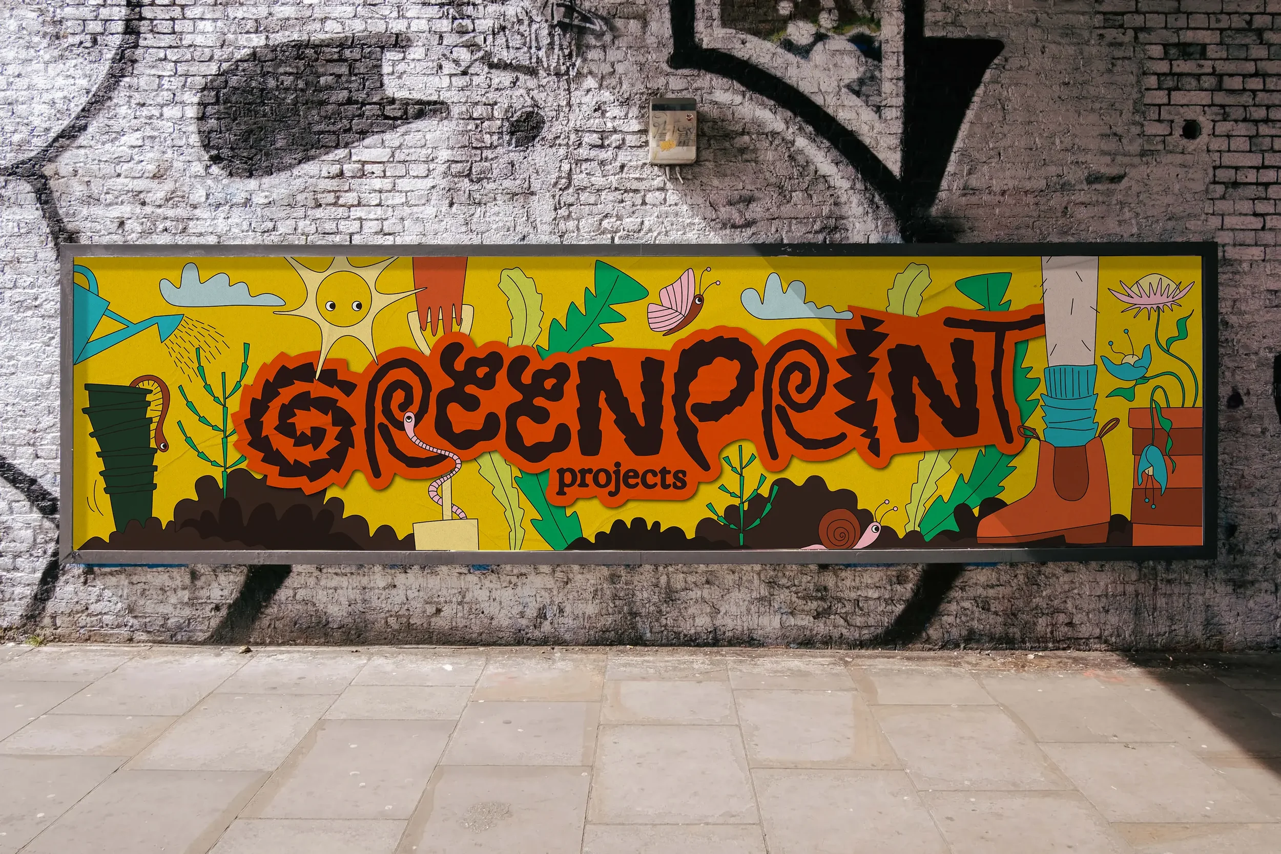
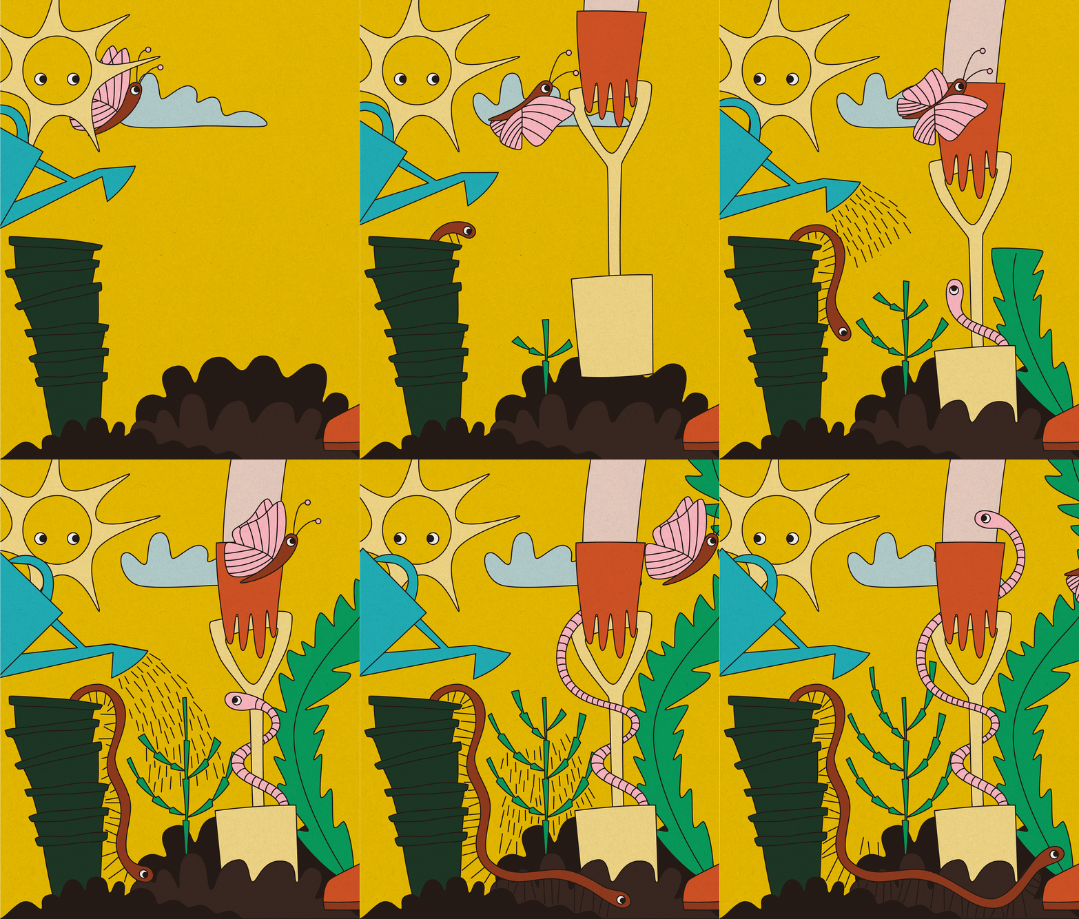
The hand drawn wordmark uses Australian native leaf shapes to form the letters, laid out in the graffiti/street style that the teens we talked to loved. We then took the developed brand style and colour palette and created a richly layered garden animation that brings the youthful energy of the brand to life. It felt energetic, playful and a little rebellious, while still being unmistakably connected to the natural world.
The result is a brand that feels as alive as the gardens it represents. Bold enough to catch a teenager’s attention, grounded enough to speak to schools and considered enough to grow with the program. Most importantly, GreenPrint Projects now has an identity that doesn’t just communicate what they do, it makes you want to get your hands dirty.






Secrets
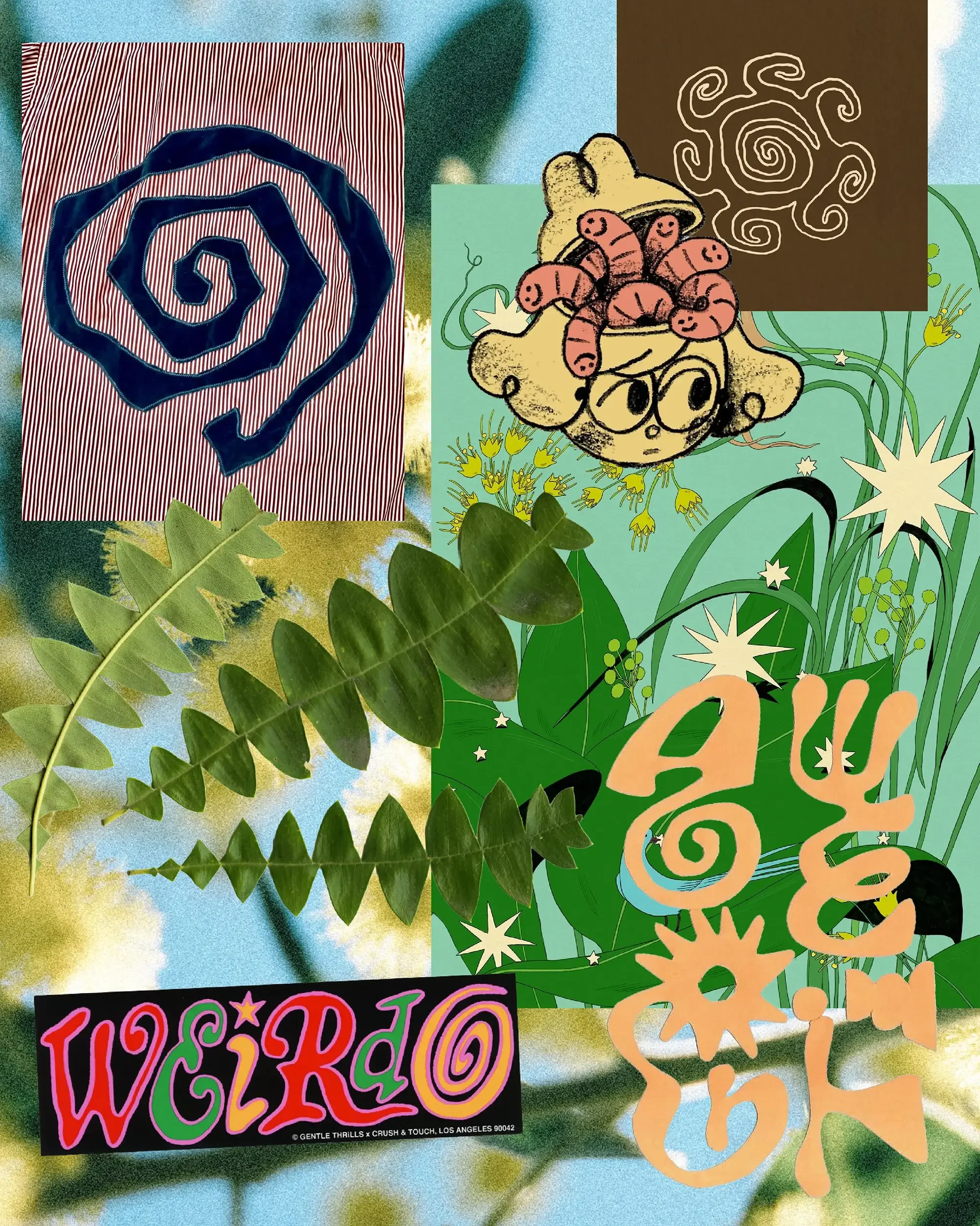
Greenprint didn’t ask for the animation that Sinéad made. She was so in love with the project that she decided to spend every spare moment she had whipping it up, just because.
Project scope
Brand Design
Signage
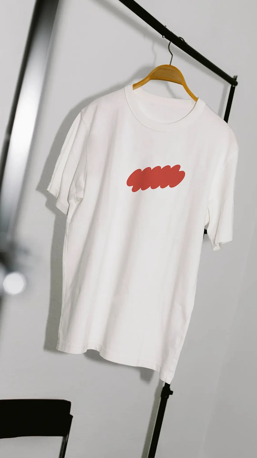
Merch
Illustration
Animation
Kind words
Studio Dreams bring a thoughtful and distinctive approach to design. They took the time to understand the purpose, values and vision of GreenPrint Projects, translating these into branding and a website that are authentic, dynamic and visually engaging.
Their ability to listen, interpret ideas and create a cohesive visual identity is exceptional. Sinead and Alexis captured the essence of GreenPrint Projects with creativity, clarity and purpose, giving us a strong platform to communicate our work and connect with our community.
— Anthea Rafferty, Founder and Executive Officer, GreenPrint Projects