Pepe
About Pepe
Pepe was originally called Donna. The branding was heading in a retro surf direction, with bold colours, playful typefaces and plenty of personality. Then one day, Julia pivoted. Then pivoted again. And this is one of the great things about working with other creatives: they know the exact moment when something just clicks, and this was a brilliant example of it.
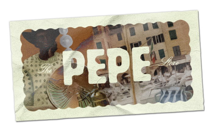
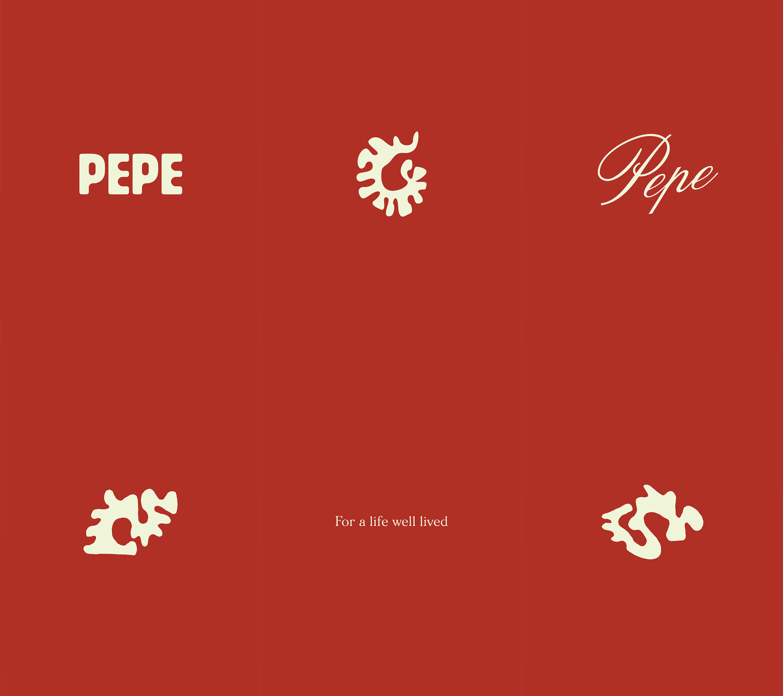
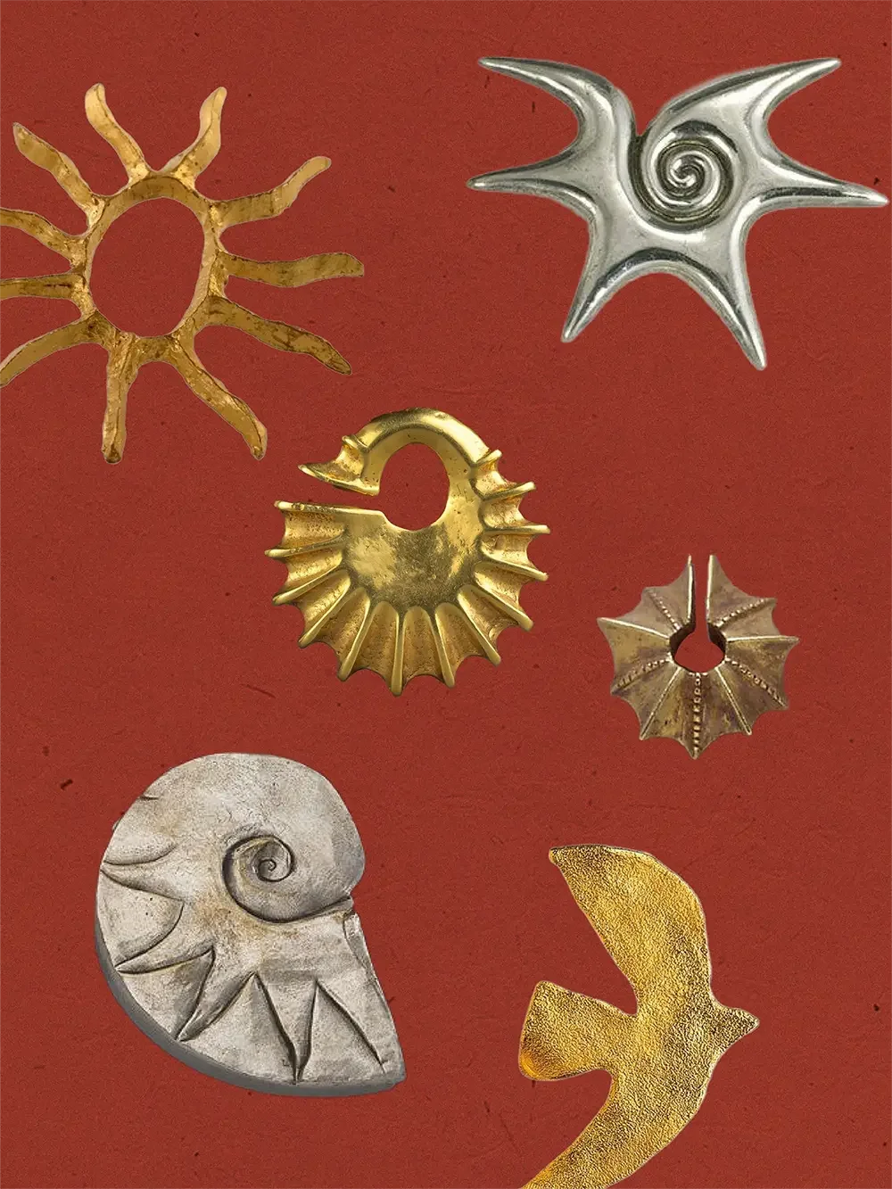
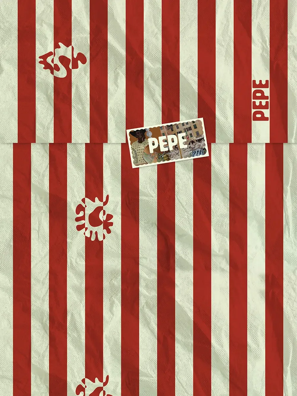
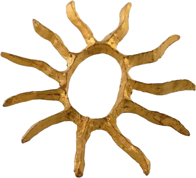
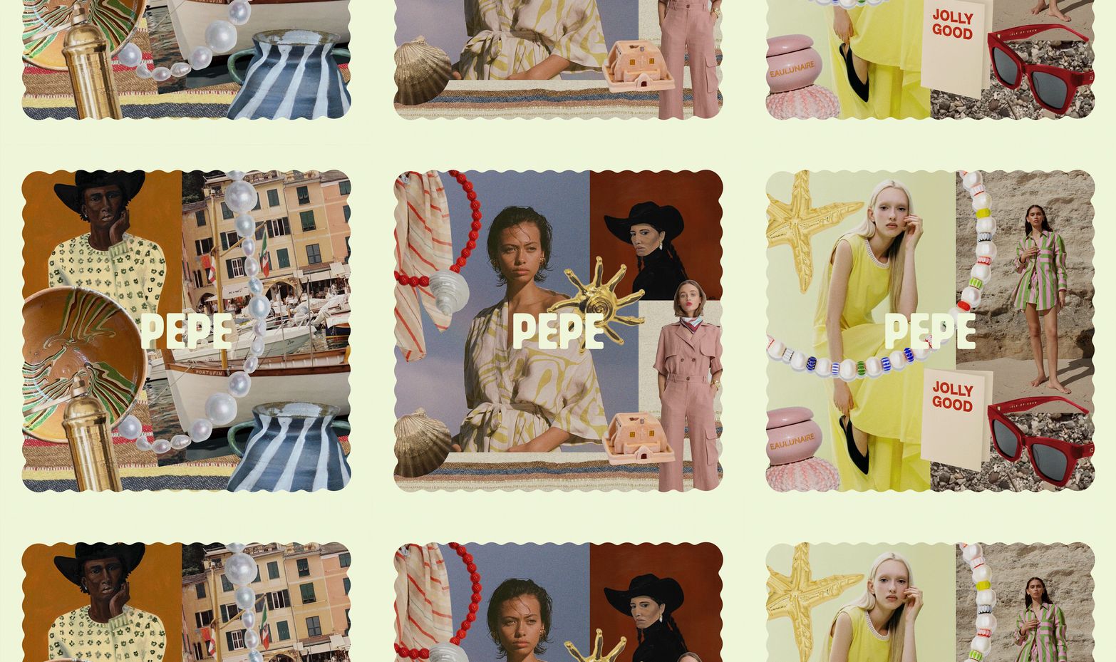
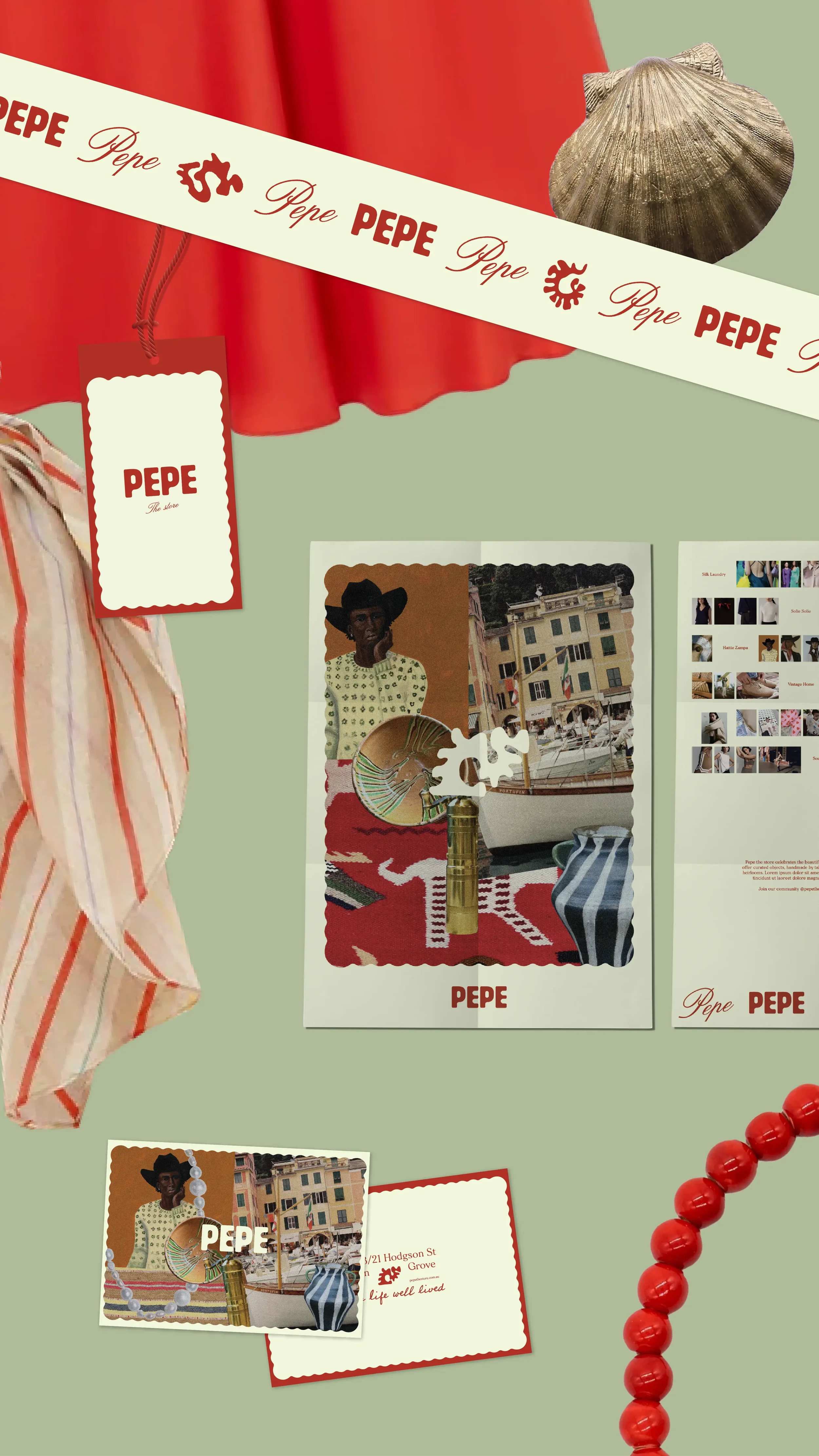
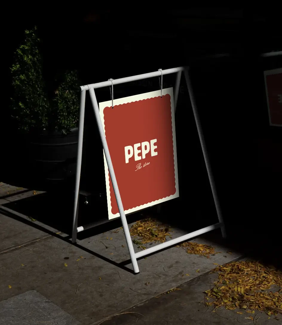
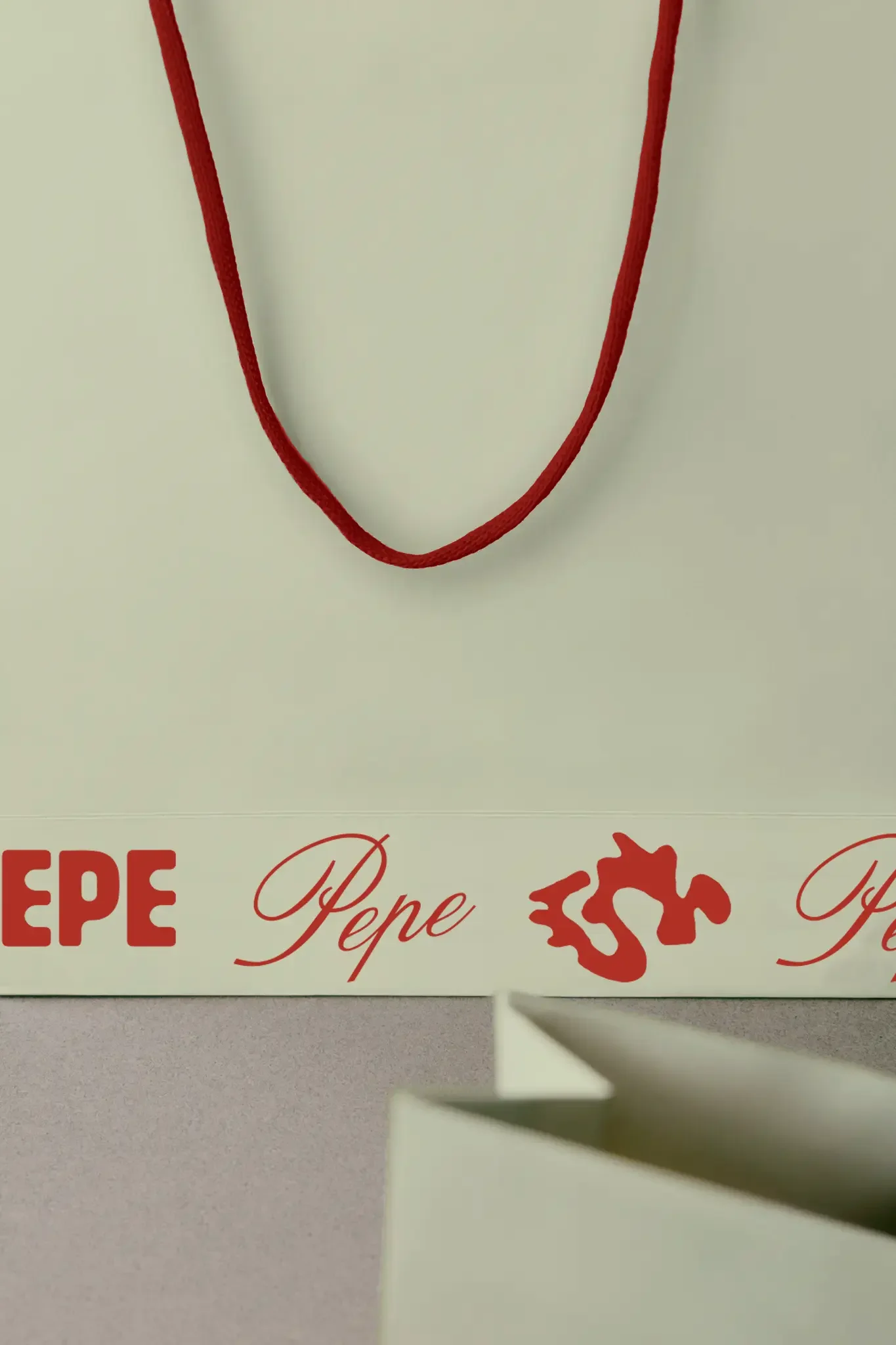
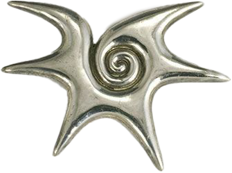
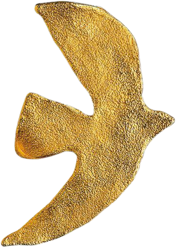
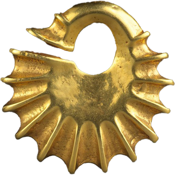
Introducing Pepe. A Barwon Heads boutique filled with heirloom-worthy treasures and Euro-vacay-ready fashion. The Pepe logo suite features Ancient Greek-inspired sun drawings, alongside two distinct wordmarks: one casual, one dressy. A little nod to the classic fashion sales pitch: You can dress it up or dress it down.
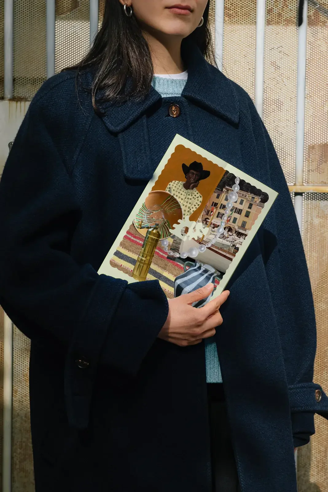
We’ve worked alongside Julia for years for her Port Fairy store, Penny and Reiby. It was there that we saw just how effortless her creativity can be. Julia has a knack for pulling together pieces; tucking, layering and adding until it becomes an complete look you cannot leave the store without. It was this flair that we tried to capture in the Pepe branding: eclectic, effortless and a little bit unexpected, with just enough polish to make the whole thing feel completely considered.
Secrets
Julia had so much faith in us for this project that when we opened our first presentation document she screamed ‘Love it’ to the virtually empty cover page.
Project scope
Brand design
Signage
Stationery
eCommerce website
Instagram design
Art direction
Kind words
Love love love Studio Dreams. I have had a long association with these girls and have always enjoyed collaborating with them. I love their creative and unique take on things, always interpreting the vibe so perfectly. I highly recommend their services.
— Julia Allen, Owner and style icon